His home in Giverny, France had 231 woodblocks and Hokusai’s art was one of them. Many of Hokusai’s paintings were primarily landscapes. This inspired Monet to paint landscapes and eventually his waterlilies series.
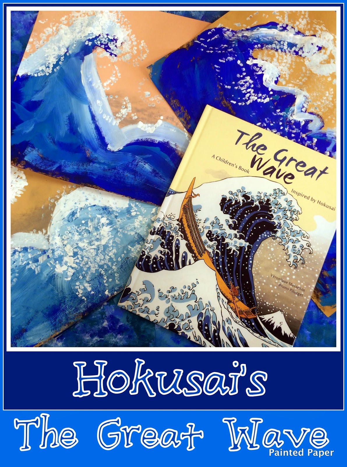
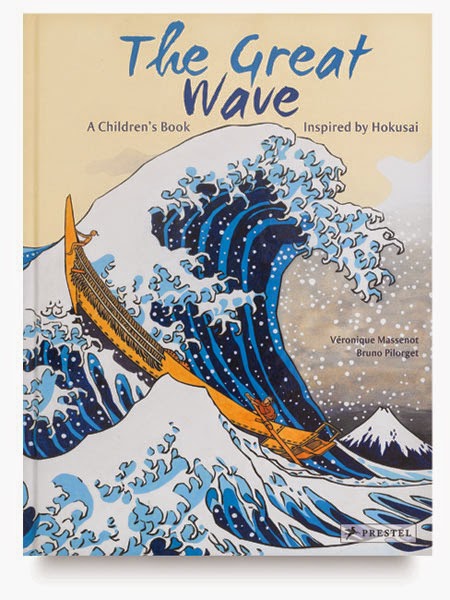
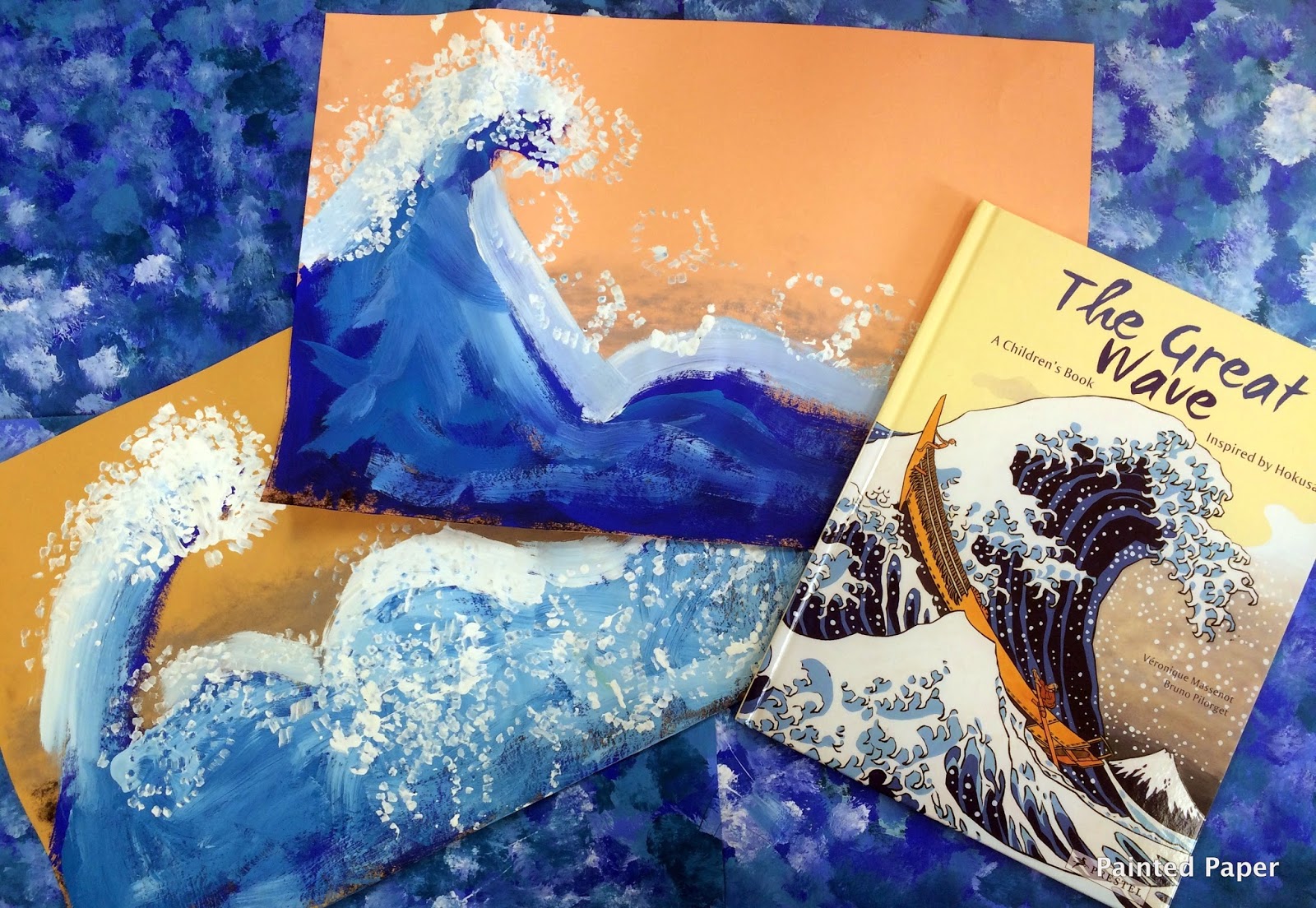
Keeping with our Thematic Unit : Colors of the Sea, my 1st grade students created these beautiful paintings inspired by Hokusai. We used the wonderful book- The Great Wave written by Bruno Pilorget
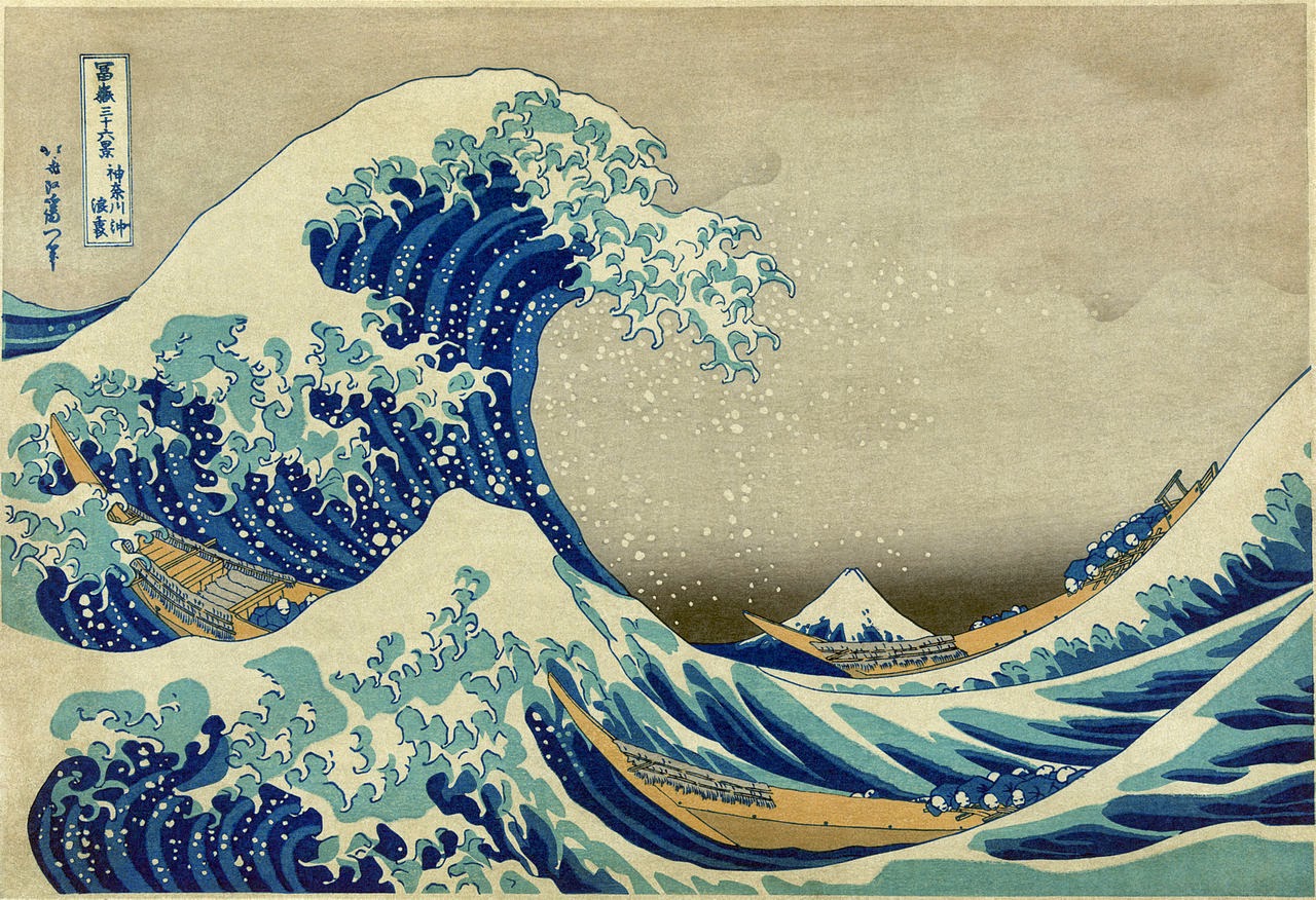
Hokusai’s most famous work is The Great Wave.
It depicts a huge wave threatening boats off the land of Kanagawa. Many believe that the wave is a tsunami but actually it is a large wave on the open sea. In all of Hokusai’s prints of the wave series, Mount Fuji always appears in the background.
Supplies Needed:
• 12 x 18 Various shades of light construction paper
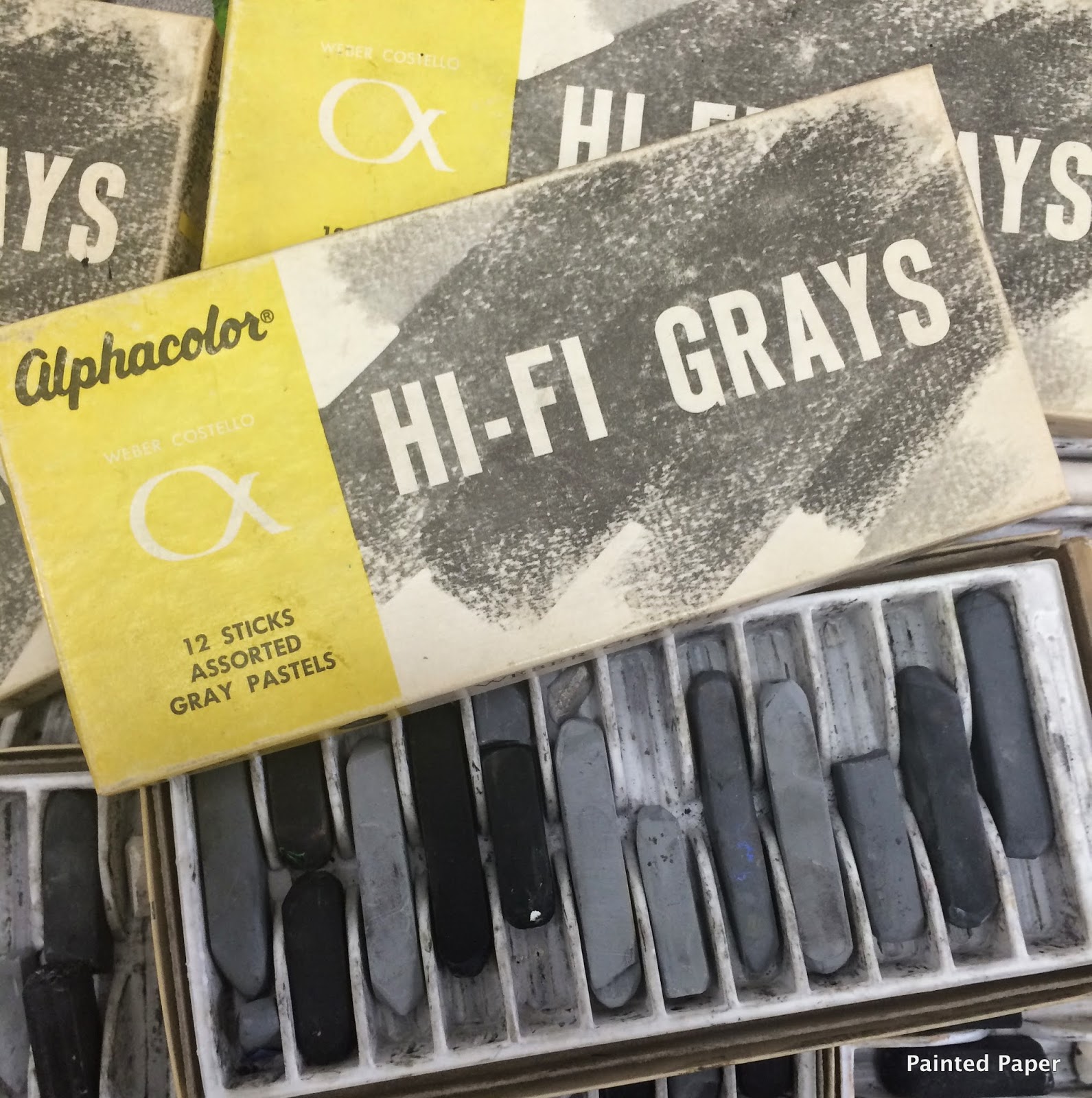
• Gray Pastels
• Blue and White Tempera Paint
• Large brushes
Creating the Background
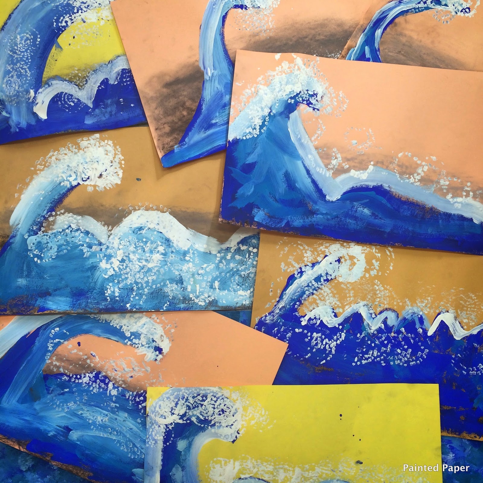
After examining this colorful book and its vibrant images, students created a gray value scale on the construction paper background using various shades of gray pastels.
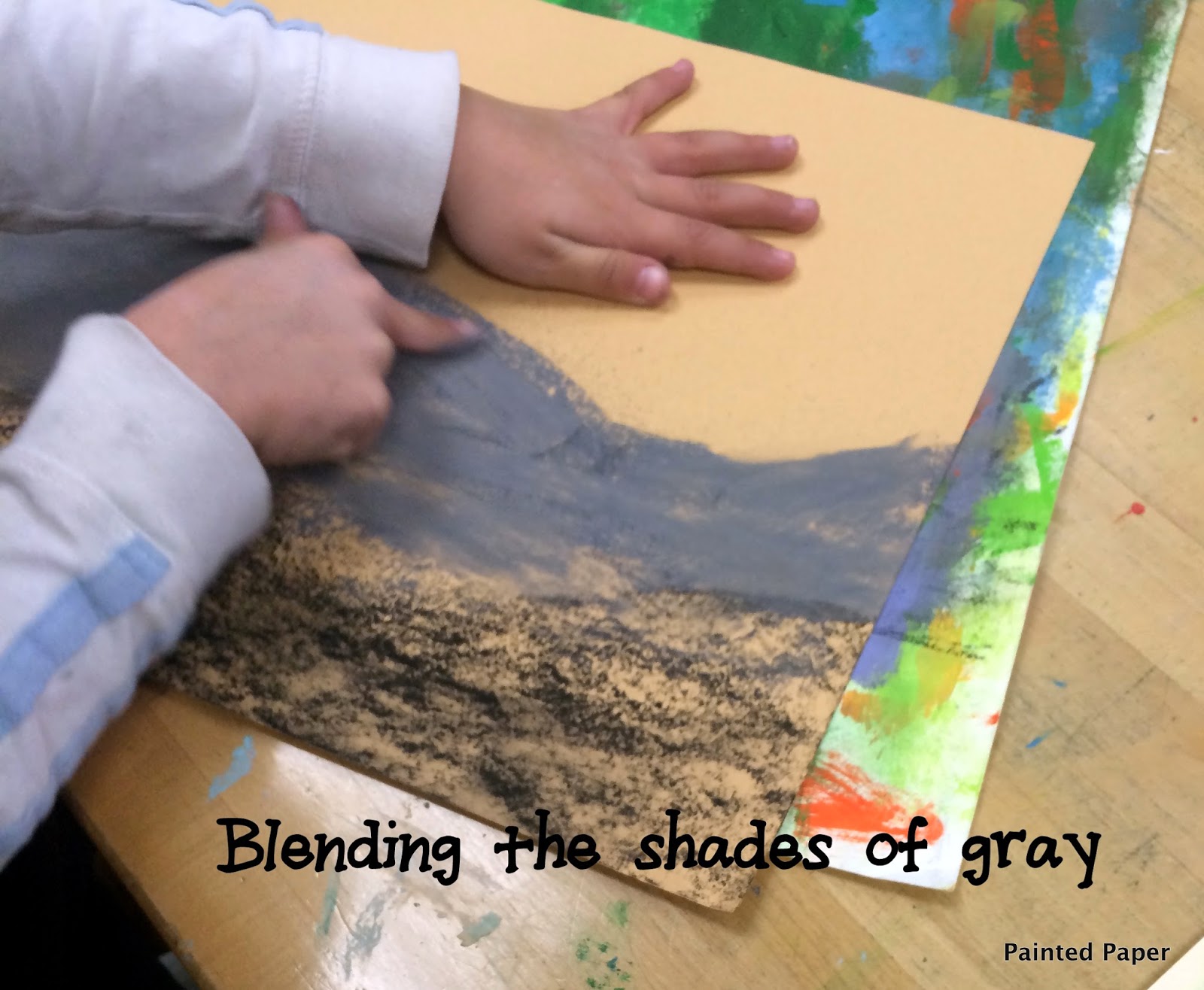
Students shaded the lower part of their paper with dark charcoal gray, then proceeded with the lighter grays towards the top of the paper.
Creating the Ocean and Wave
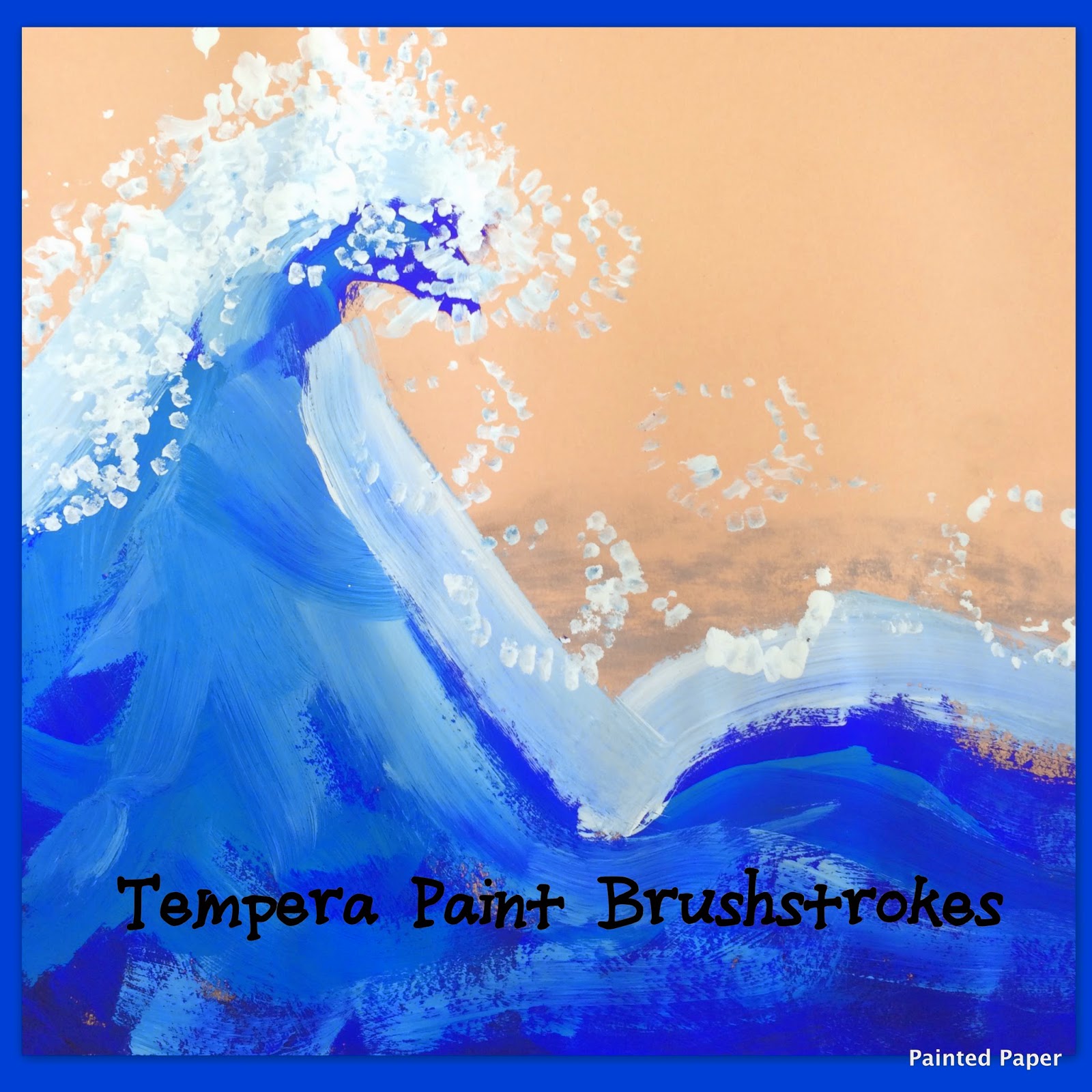
Next, students took dark blue paint and painted the wave and water. We used the letter “C” to make a wave. After the dark blue, students used a lighter blue on top, then added white to represent the waves. I love seeing the brush strokes in the waves.
Adding the Crest of the Waves
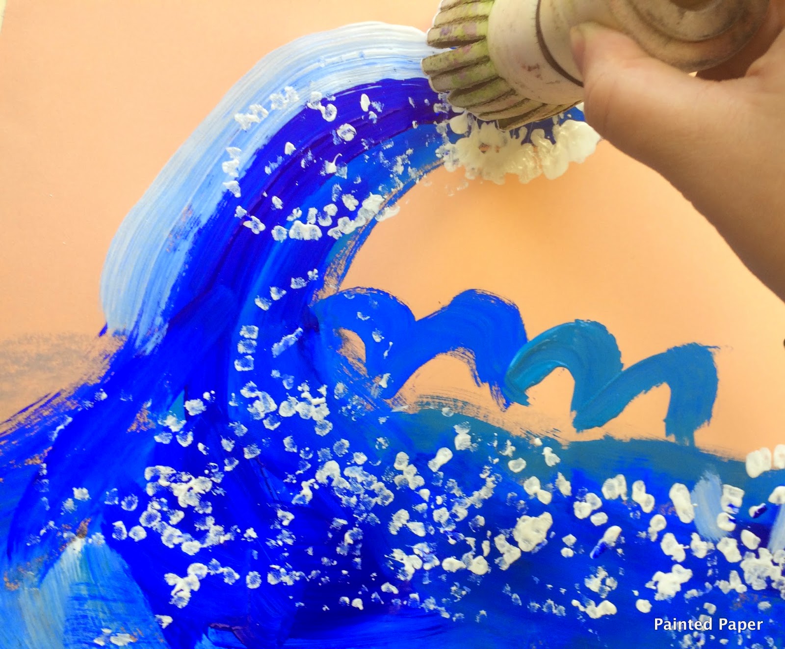
Students used a foam brush to create the white crest on the waves.
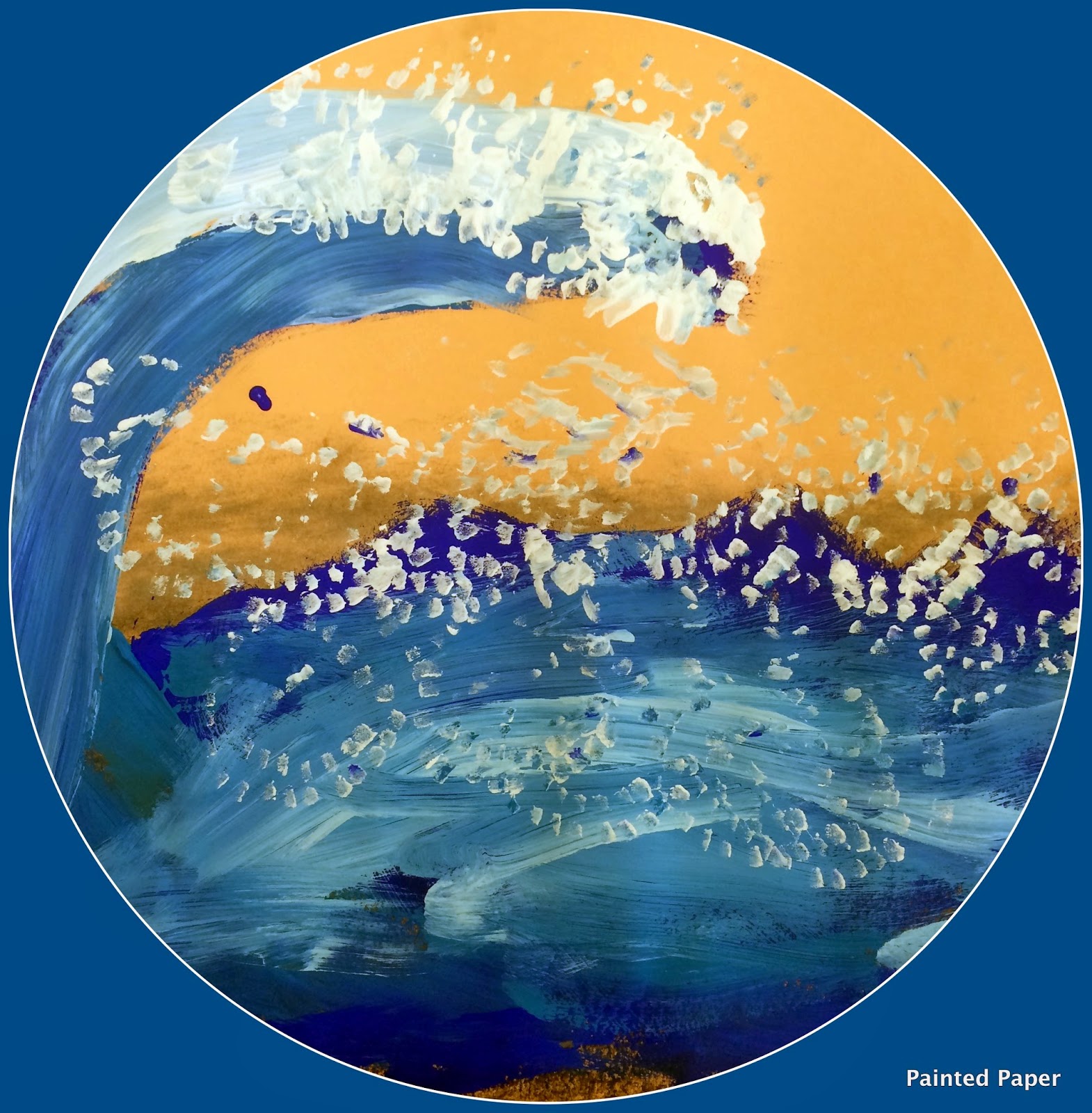
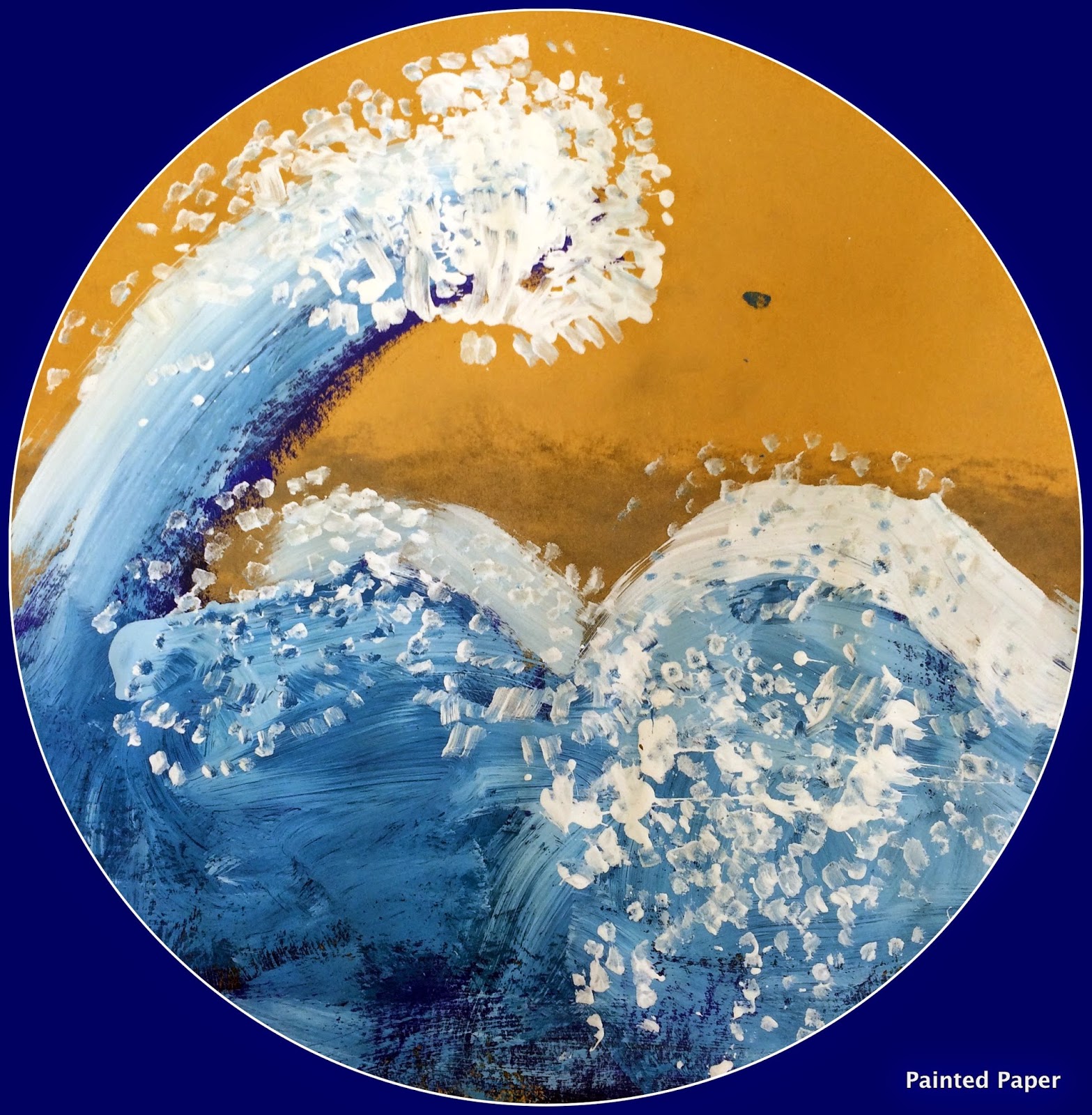

Brilliant! I love the charcoal shading under the wave! Is the circle just a photo crop? It looks cool – maybe the kids would want their work round!
Thanks!!! It is a photo crop and I thought kids would like it too! 🙂
I love these!
What grade did you do this project with?
1st grade 🙂
I want to do this project with my art class on Friday and am wondering about the charcoal value shading underneath – is there an explanation you could give about why that is included? I'm guessing it makes the paint richer but I want to be able to explain it well to my students. Thanks so much – you're awesome!
I did this with my class but used white packing peanuts for them to dip in the tempera paint. Looked great…however the overzealous ones who put a lot of paint on had paint chipping/falling off when it dried. In addition to applying less paint, what do you suggest?
I try to demostrate when using too much paint the paint will flake off. I always share with my students this quote, “using too much paint is not always good. The paint will flake off your paper and you will not be pleased.” The more your students paint the more they will understand the process. 🙂
Where did you get your brush that you used for the crests of the waves? What is the purpose of the shading under the waves? Thanks!
To create a shadow under the wave.
I would love to buy the foam brush–where is it sold/. Thank you!
These are the ones available at school speciality Roylco Funny Floppy Foam Paint Brushes, Set of 6
Are those soft pastels? Would oil pastels work too or would it create an issue with the tempura paint?